Combodo is committed to accessibility, for an ever-improving user experience.
For several years now, we have become more aware of the issue. We have been striving to ensure that our products are accessible to everyone, whether by making them easier to use or by improving interfaces. Also by gradually improving an accessible ITSM solution, particularly with regard to helping people with disabilities.
These steps to making iTop as accessible as possible, are Combodo’s way (among others) of making its “ITIL for all” credo a reality.
We now follow all the WCAG AA rules to the letter. Let’s take a look at what we’ve been up to since iTop 3.0.
What kick-started the changes? Where’s the metadata hiding?
When we were developing the old iTop interface, it could be tricky to pass on meta-information to accessibility software. In fact, the information and the display itself weren’t centralised. However, through individual and collective efforts, we managed to make the old interface a little more accessible for screen-reading software.
We gradually learned how to make the connection between what information is being displayed, and what a screen reader interprets. We went through all iTop’s screens to make sure they were ‘reader-friendly’.
Colours
And that’s when another problem jumped out at us: we weren’t using colours for semantic purposes.
On the legacy interfaces, for iTop versions up to 2.7, all the actions are in orange, with white or black text on top, none of which complies with any of the accessibility colour rules.

iTop 3.0 marks a shift towards accessibility
New, accessible structures
As we envisaged iTop 3.0 and its Fullmoon design, these previous experiences helped lay the foundations for the new version.
Combodo completely revamped the data display and user interface to maximize accessibility for screen readers. The redesign includes a high-contrast layout that meets WCAG AA standards and, in the long run, aims to comply with WCAG AAA standards.
The iTop Lighthouse score improved significantly after we optimized keyboard navigation, making it easier for users to move throughout the application
To further enhance the user experience, we made additional updates to the themes, ensuring they are more accessible for people with disabilities.
More themes for iTop console
Testing the portal’s “high contrast” theme
At the root of the changes to the iTop console (agent back-office) that we’ll look at below, several customers on the iTop portal brought a second requirement to our attention .
Adding themes to the portal was already a possibility, but these customers especially wanted to provide a high-contrast theme for the visually impaired.
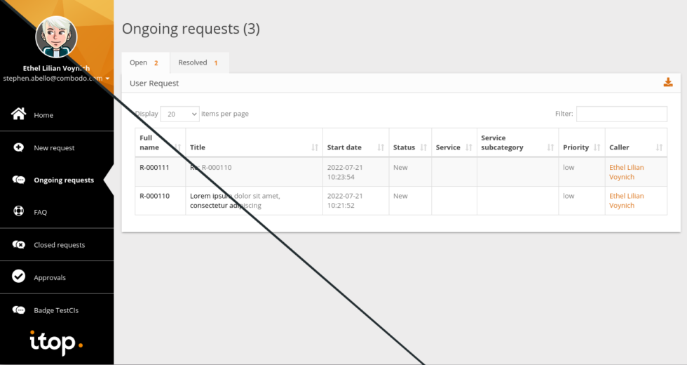
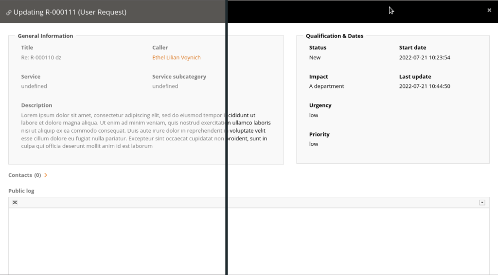
Combodo developed a high-contrast theme on a specific profile for one customer. Below we can clearly see the difference, compared with the standard theme!


However, it proved difficult to take what we developed for a specific project and apply it to the standard iTop portal, due to the portal’s current technical structure.
Still, if one wants iTop to provide an ITSM portal that is accessible to their users, they can of course customise it, like the rest of the solution.
After experimenting with the high-contrast portal theme on iTop 3.0, Combodo carried further research on the iTop console. This resulted in three additional themes being added to iTop 3.2.
Themes for colour-blind people
Designed to help users with colour blindness, we added two new themes to address specific cases:
- One for protanopia and deuteranopia (red and green colour blindness respectively)
- Another for tritanopia (blue colour blindness)
High-contrast theme
This theme, with its higher contrast, should help users make out the different items on the screen more easily.
It is particularly well suited to helping colour-blind or visually-impaired users recognise the different items on the interface.
Each successive version of iTop 3.0 adds new features to make the solution even more accessible.
The iTop 3.2 console complies with all the WCAG AA rules. It is important for us to guarantee access for everyone who uses iTop as their day-to-day ITSM solution.
These operators make their users’ work easier, and we try to do the same for them as far as possible, and accessibility is part of the user experience optimisation process.
Curious about iTop 3.2 and its accessibility features?
DISCOVER ITOP 3.2 LTS
Watch the Webinar replay now to learn more!


